I made a model...the 1st image is just a picture of it...I havn't photoshop-ed it yet, any suggestions before I do? The second was just a picture I took of the parts before I stuck it together, and was bored so just threw on a cheeky bike and thought it worked quite well...all needs work though...
Wednesday, 5 May 2010
Cutting People Out
Don't bother, check this website out: http://vyonyx.com/category/down/cutout-people/
Tuesday, 4 May 2010
Also for some reason the blog isnt letting me comment on anyones work... it keeps telling me to "choose a profile". have no idea whats up with it. So will do it this way... wisdom Jacko powers i really like your section, i think the contrast of dark and light from top to bottom is really effective and the view of the section with the text script in the background works well. am i right in thinking that the images at the end are a photographic projection...?? Natalie, i really like your plan although maybe the section could use some people to show the scale better and the occupation of the spaces. And Michelle i really like your perspective section and think your plans look amazing. I agree with jack on the transverse section, maybe blend it in with the context more, by playing around with transparency, tone or even shading the internal spaces.
Layout sheets


Here is an example of one of my night/day elevations and an example section. I am a bit unsure on the ground and the sky for the section, or maybe the section in general...? have changed the layout from the previous sheets to make each page more coherent by having one image strip across a page. should i maybe do 2 elevations to a page or keep it as it is? any advice or construction criticism on the pages feel free guys. Cheers. xx
Perspective section
Final Plans


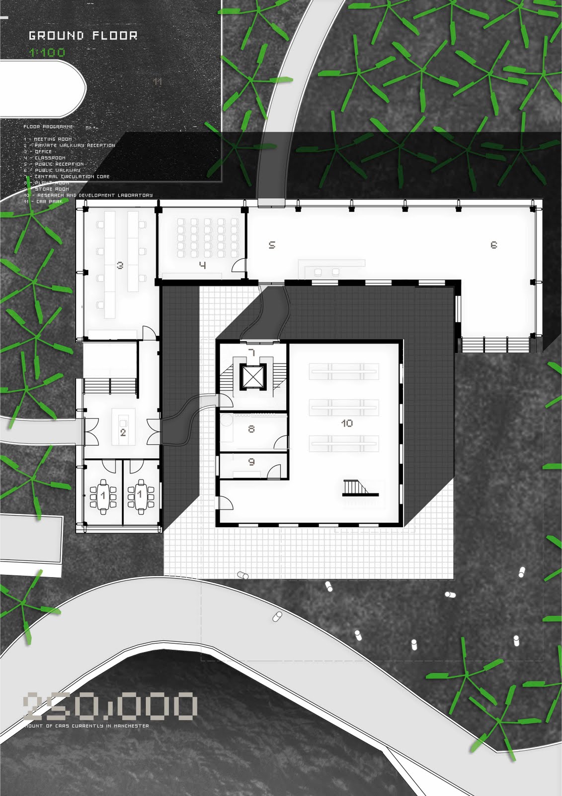
Hi, just posting up an example plan for peoples thoughts, do you think it needs to be bolder? And, I'm struggling with my 1:200 section and was wondering if anyone had any suggestions for the interior rendering, I tried doing some shading etc but it just made it all blur into one and wasn't very clear. Cheers xxx
plans and sections
Hey, this is a sample of what my final plans and sections will look like.. just wondering if the plan is clear enough or are some of the lines still too feathery? my facade has silhouette images etched onto them.. not sure if the difference between facade and actual people silhouettes is clear in the section?


Is this type of section allowed?!
Thinking of doing my section like this:

Did the crooked cut so it would follow the circulation path of the building and the off angle perspective just looks a bit tastier than face on.
Thing is I don't know if I'ma get bummed for this? Is that an acceptable section? (gunna tart it up in photodouche later on too)

Did the crooked cut so it would follow the circulation path of the building and the off angle perspective just looks a bit tastier than face on.
Thing is I don't know if I'ma get bummed for this? Is that an acceptable section? (gunna tart it up in photodouche later on too)
Drawings
What size are people doing plans and are they gonna be the same size as plans and sections or differ from 1:100 to 1:200?
Sunday, 2 May 2010
1:50 Section
Hey guy just trying to get my detailed 1:50 section on a page but because of the size of it and all the detail within in it the pdf comes out distorted. Just wondering for this section is it acceptable if we cut out chunks of the building out or if we just show part of the buildings detail? Or does it definately have to show the whole slice of the section if that makes sense?
Portfolio Pages
Everyone should upload portfolio pages as and when they are done, that we we can all comment to make changes, it's easier to see any mistakes when you haven't just spent hours making it. good luck everyone.
Saturday, 1 May 2010
Thursday, 29 April 2010
Subscribe to:
Posts (Atom)